Understanding and interpreting box plots
How to read a box plot/Introduction to box plots
Box plots are drawn for groups of W@S scale scores. They enable us to study the distributional characteristics of a group of scores as well as the level of the scores.
To begin with, scores are sorted. Then four equal sized groups are made from the ordered scores. That is, 25% of all scores are placed in each group. The lines dividing the groups are called quartiles, and the groups are referred to as quartile groups. Usually we label these groups 1 to 4 starting at the bottom.

Definitions
Median
The median (middle quartile) marks the mid-point of the data and is shown by the line that divides the box into two parts. Half the scores are greater than or equal to this value and half are less.
Inter-quartile range
The middle “box” represents the middle 50% of scores for the group. The range of scores from lower to upper quartile is referred to as the inter-quartile range. The middle 50% of scores fall within the inter-quartile range.
Upper quartile
Seventy-five percent of the scores fall below the upper quartile.
Lower quartile
Twenty-five percent of scores fall below the lower quartile.
Whiskers
The upper and lower whiskers represent scores outside the middle 50%. Whiskers often (but not always) stretch over a wider range of scores than the middle quartile groups.
Interpreting box plots/Box plots in general
Box plots are used to show overall patterns of response for a group. They provide a useful way to visualise the range and other characteristics of responses for a large group.
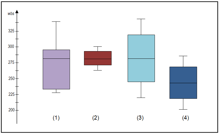
The diagram below shows a variety of different box plot shapes and positions.
Some general observations about box plots
- The box plot is comparatively short – see example (2). This suggests that overall students have a high level of agreement with each other.
- The box plot is comparatively tall – see examples (1) and (3). This suggests students hold quite different opinions about this aspect or sub-aspect.
- One box plot is much higher or lower than another – compare (3) and (4) – This could suggest a difference between groups. For example, the box plot for boys may be lower or higher than the equivalent plot for girls. Follow this up by looking at the Items at a Glance reports.
- Obvious differences between box plots – see examples (1) and (2), (1) and (3), or (2) and (4). Any obvious difference between box plots for comparative groups is worthy of further investigation in the Items at a Glance reports.
- Your school box plot is much higher or lower than the national reference group box plot. This also suggests an area of difference that could be explored further in the Items in Detail reports and through consultation.
- The 4 sections of the box plot are uneven in size – See example (1). This shows that many students have similar views at certain parts of the scale, but in other parts of the scale students are more variable in their views. The long upper whisker in the example means that students views are varied amongst the most positive quartile group, and very similar for the least positive quartile group. The Items in Detail reports can be used to explore this further.
-
Same median, different distribution – See examples (1), (2), and (3). The medians (which generally will be close to the average) are all at the same level. However the box plots in these examples show very different distributions of views.
It always important to consider the pattern of the whole distribution of responses in a box plot.