Item reports
The Item report is made up of strip graphs that provide a summary of how groups of teachers or students responded to each survey statement. Item reports can be generated for:
- students, based on the aspects; and
- teachers, based on the questions and sections of the survey
The reports provide you with detailed information about how students or teachers responded to each of their respective survey questions. All Item reports use survey score based on the raw data. The strips show the proportions of respondents who answered in each agreement category.
The Item report shows the items (or questions) included in each aspect and sub-aspect. To help keep students’ or teachers’ results confidential, the reports only become available after at least 10 students or at least 5 teachers have completed the W@S surveys.
These reports will be most helpful after the School overview (circular) and the Aspect (box plot) reports have been studied. They will enable a more detailed analysis of any areas of interest and will provide the ability to compare (very broadly) some responses from staff and students. A number of questions in each of the sruveys are very closely related, and even though these are reported differently (see next section for details) an indicative comparison is possible.
Interpreting the Item reports
Item report (student and teacher data)
The report displays the survey statements used in the section on the left hand side of the page. Next to each statement is a strip graph showing the proportion of students or teachers who chose each of Strongly disagree, Disagree, Agree, and Strongly agree. For the aspect, Aggressive student culture, the responses are: Never or hardly ever, 1 or 2 times a year, 1 or 2 times a month, 1 or 2 times a week, and Almost every day.
For the Item report for student results a shadow strip graph plotted behind the school’s strip graph represents the pattern of responses from relevant national reference data. There is no reference data for Item report for teacher results. A large discrepancy may indicate that further investigation would be useful. Note that the reference data indicates an average over a large representative sample. It does not provide a “standard”, or a goal.
A dividing line down the middle of the report is used to separate the strongly agree and agree categories from the strongly disagree and disagree categories. For the aspect Aggressive student culture a dashed line distinguishes it from other aspects.This allows the reader to see the overall level of agreement or disagreement with an item.
If fewer than 10 students or 5 teachers respond, the graphs will not display to ensure anonymity.
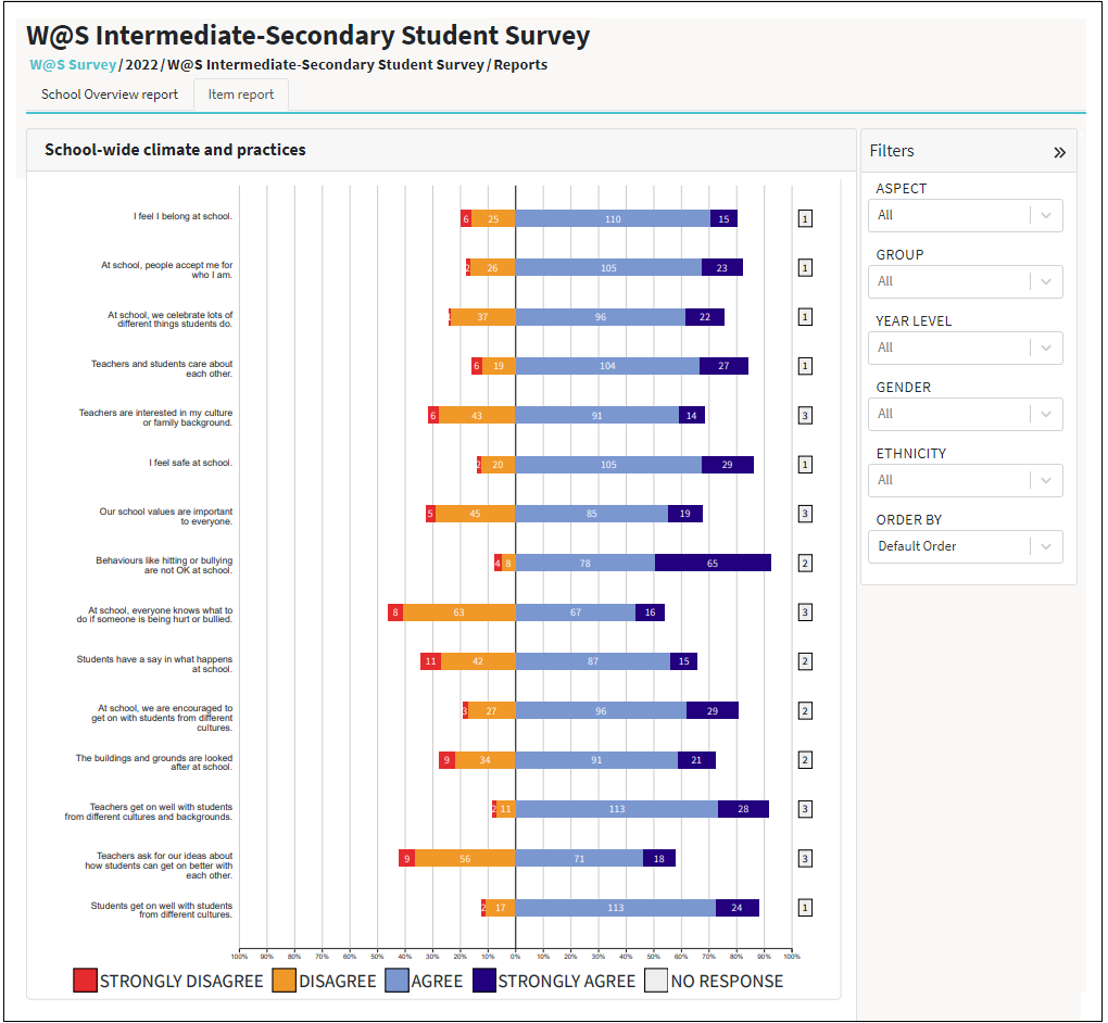
Example of a W@S Item report:
Comparing the Item reports
When making comparisons it will be important to bear in mind the number of students who have responded to the surveys. When the numbers represented in the graphs are small (fewer than about 30 students) a large percentage difference between groups may equate to only a few students.
Comparing across year levels needs care. Students in Years 9 and 10 are less positive on average than students in Years 5–8. In other words a drop in positivity in your school between these year groups may be due to a national trend, rather than something attributable to your school in particular.
Students from different cultural backgrounds tend to respond differently to survey questions. For example, Pasifika students tend to respond more positively overall. Consider how the mix of students at your school might influence your school data.
Sometimes one sub-group (for example a class, gender group, or ethnic group(s)) may develop a culture that is different from other sub-groups. Look at your data by sub-group to see if this pattern is evident. If present it may be an indication that further discussion amongst staff is needed, or it could provide a catalyst for useful conversations with particular groups of students.